Project
Overview
Project
Overview
We redesigned a tool called Revenue Manager, used by data analysts in the energy sector. Through stakeholder interviews and usability testing, we uncovered key pain points around system complexity, poor documentation, and inefficiencies in navigating customer data. Our solution focused on building a more intuitive, customizable interface that streamlined workflows, reduced cognitive load, and gave users greater control over their workspace.
We redesigned a tool called Revenue Manager, used by data analysts in the energy sector. Through stakeholder interviews and usability testing, we uncovered key pain points around system complexity, poor documentation, and inefficiencies in navigating customer data. Our solution focused on building a more intuitive, customizable interface that streamlined workflows, reduced cognitive load, and gave users greater control over their workspace.
Time: 8 weeks
Tools: Figma
Team: Jasmine Tran, Hung Ho, Daniel Donskoy, Sia Khorsand
Time: 8 weeks
Tools: Figma
Team: Jasmine Tran, Hung Ho, Daniel Donskoy, Sia Khorsand
[1] User Research
[1] User Research
We interviewed a total of three stakeholders. Our goal was to obtain a better understanding of the current software used for large scale management and the challenges that these stakeholders may face. Our semi-structured protocol was as follows:
We interviewed a total of three stakeholders. Our goal was to obtain a better understanding of the current software used for large scale management and the challenges that these stakeholders may face. Our semi-structured protocol was as follows:
Introduction
The interviewer introduced themselves, introduced the goal of the study, and obtained consent to record/transcribe the interview.
Background
The stakeholder was asked to describe their day-to-day work and the main tasks they undergo using specific software(s).
Observation
We asked the stakeholder to walk us through a task using the software they identified in order to specifically identify breakdowns and pain points in their work. We made sure to pay attention to any signs of frustration, hesitation, or confusion while they navigate through the technology, interrupting with questions as deemed necessary for further understanding.
USER RESEARCH FINDINGS
USER RESEARCH FINDINGS
[select stakeholder to view full interview]
[select stakeholder to view full interview]
Stakeholder #1: Data Analyst at Calpine Energy Solutions in San Diego
Stakeholder #1: Data Analyst at Calpine Energy Solutions in San Diego
Stakeholder #2: Sourcing Specialist at Leading Aerospace Company
Stakeholder #2: Sourcing Specialist at Leading Aerospace Company
Stakeholder #3: Planning Manager for San Diego County Regional Airport Authority
Stakeholder #3: Planning Manager for San Diego County Regional Airport Authority
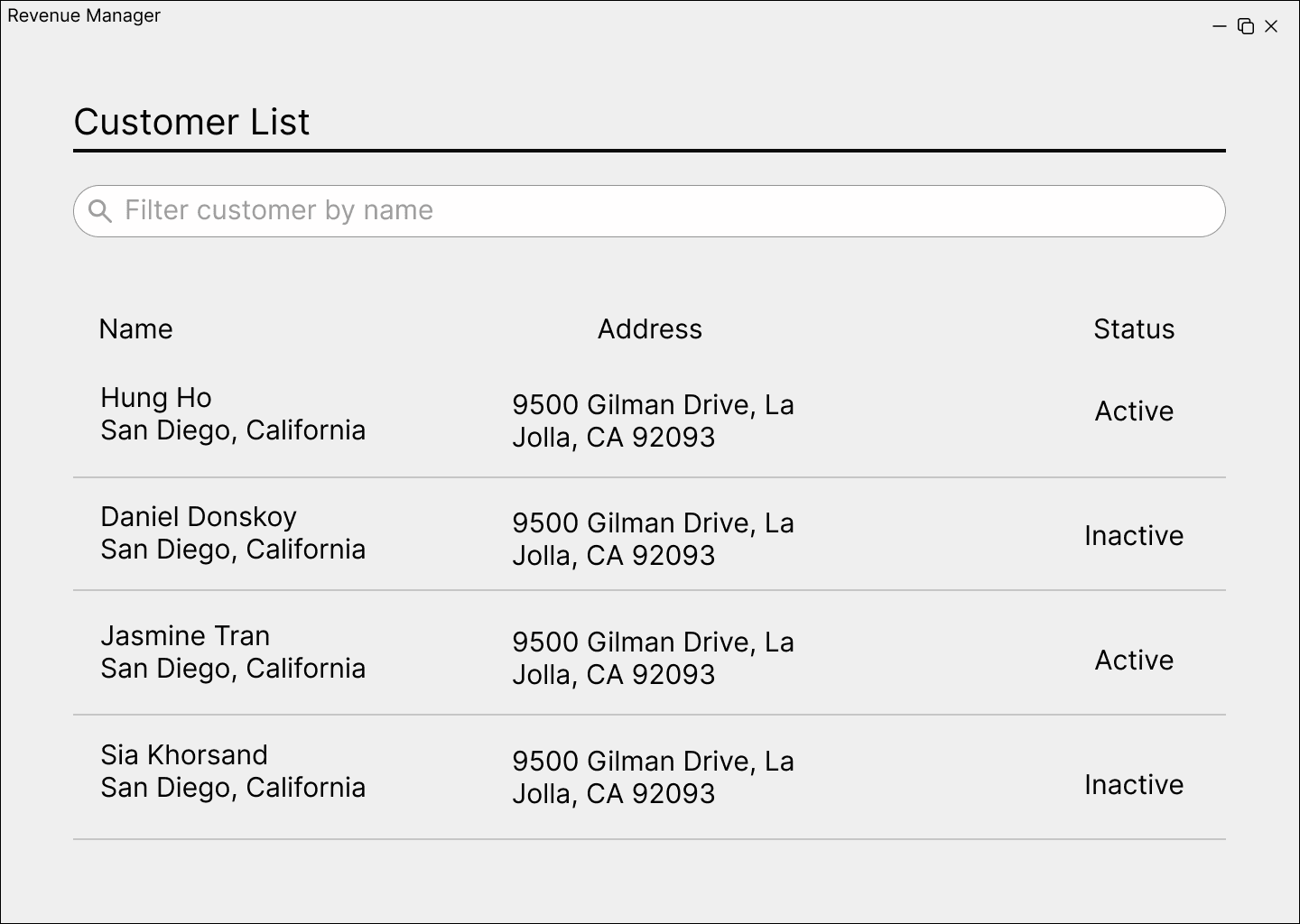
In order to ensure our product was specific, we wouldn’t be able to tackle every stakeholder’s software. We ultimately decided to move forward with Stakeholder #1’s software: Revenue Manager.
In order to ensure our product was specific, we wouldn’t be able to tackle every stakeholder’s software. We ultimately decided to move forward with Stakeholder #1’s software: Revenue Manager.
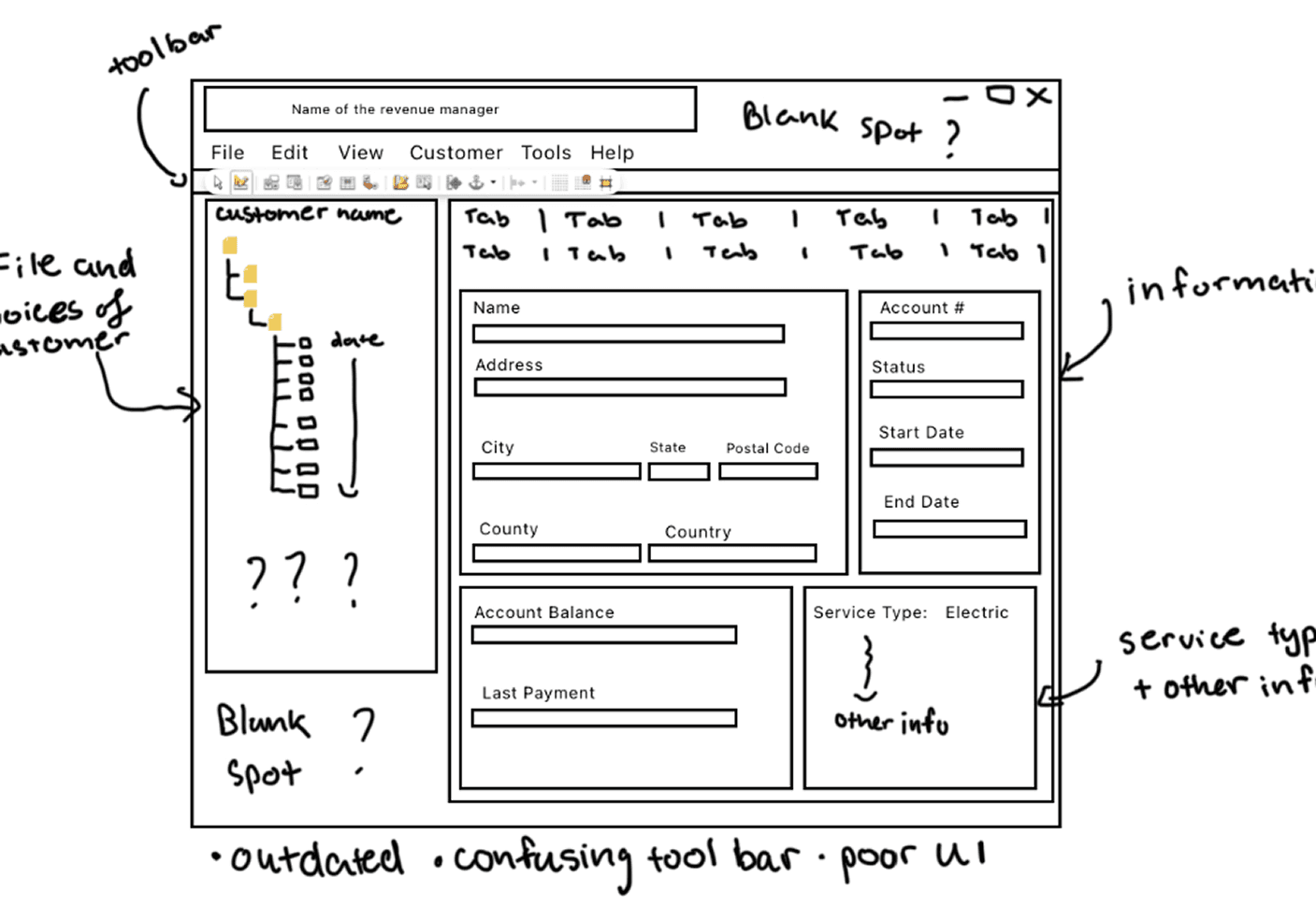
Due to privacy reasons, images of the software cannot be provided, so we have created a sketch of the main workspace of the Revenue Manager.
Due to privacy reasons, images of the software cannot be provided, so we have created a sketch of the main workspace of the Revenue Manager.
Problem Statement
Problem Statement
Data analysts who work with energy customer records face challenges with complex, poorly documented systems that have steep learning curves. This leads them to miss analysis deadlines and develop growing anxiety about falling behind on client deliverables.
Data analysts who work with energy customer records face challenges with complex, poorly documented systems that have steep learning curves. This leads them to miss analysis deadlines and develop growing anxiety about falling behind on client deliverables.
[2] UX Flows & Wireframing
[2] UX Flows & Wireframing
Our main objective was to ideate a user-friendly system that eliminates any confusion and improves efficiency and confidence while handling the software. We created a UX Flow and two sets of wireframes in order to find the best solution.
Our main objective was to ideate a user-friendly system that eliminates any confusion and improves efficiency and confidence while handling the software. We created a UX Flow and two sets of wireframes in order to find the best solution.
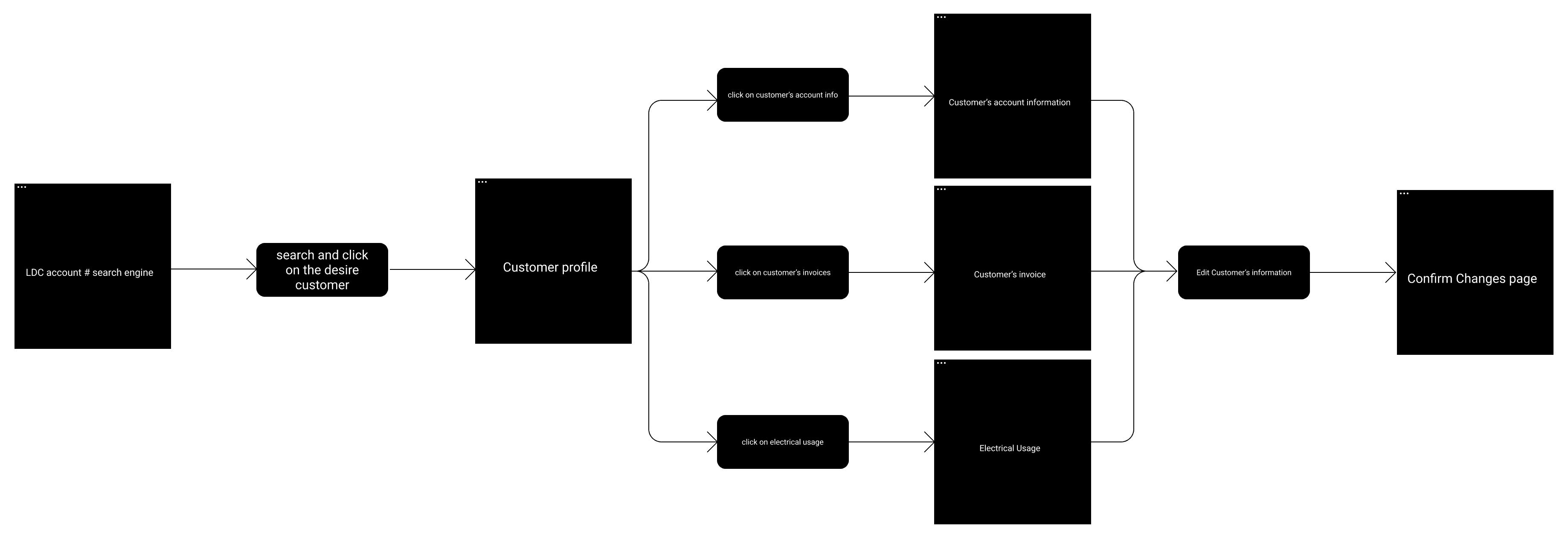
*LDC (Local Distribution Company) is used to identify a customer’s account for energy services.
*LDC (Local Distribution Company) is used to identify a customer’s account for energy services.
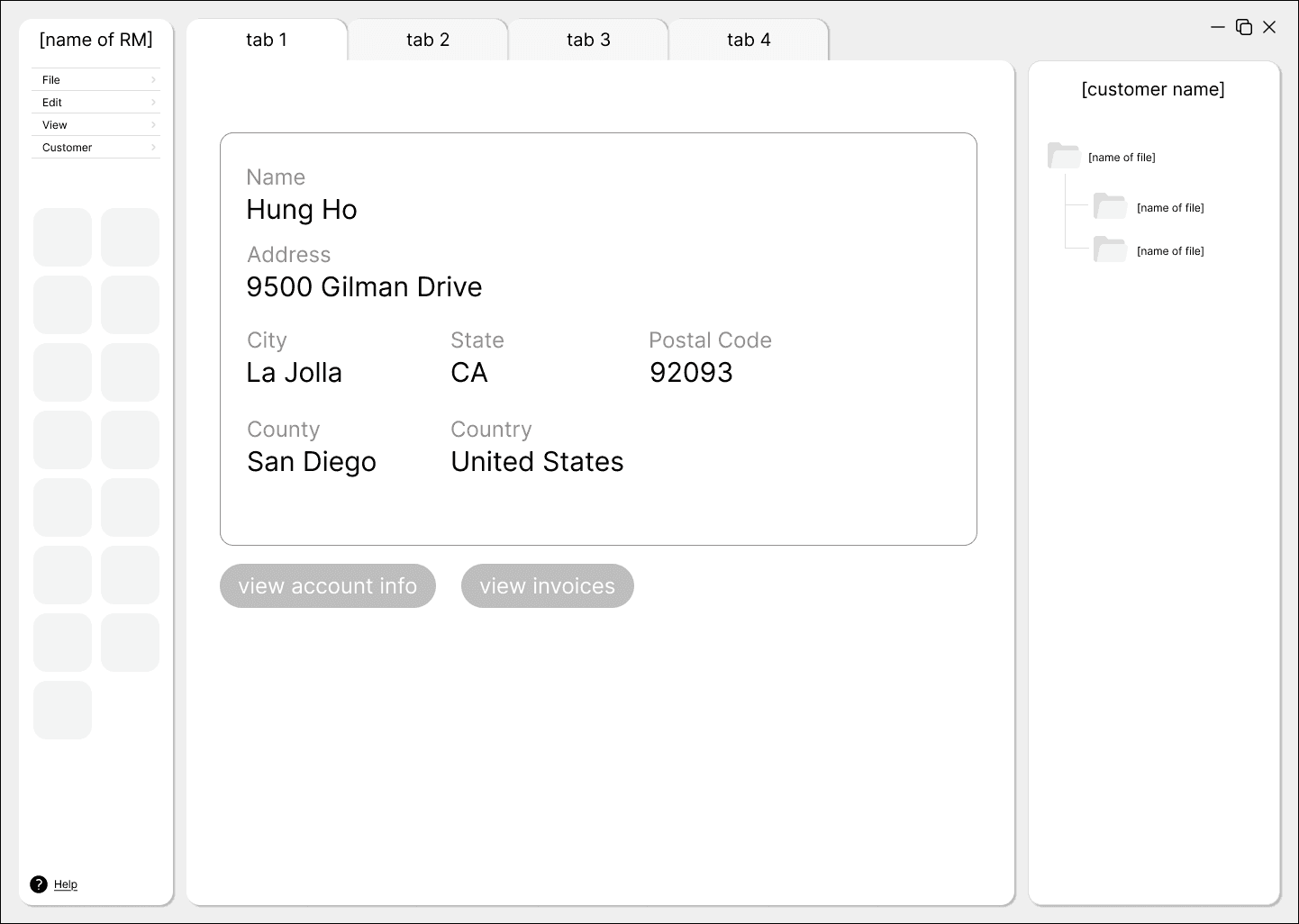
WIREFRAME 1
WIREFRAME 1
Our first wireframe explores an interface with a simple environment and a tab-based workspace that helps organize the user’s space.
Our first wireframe explores an interface with a simple environment and a tab-based workspace that helps organize the user’s space.

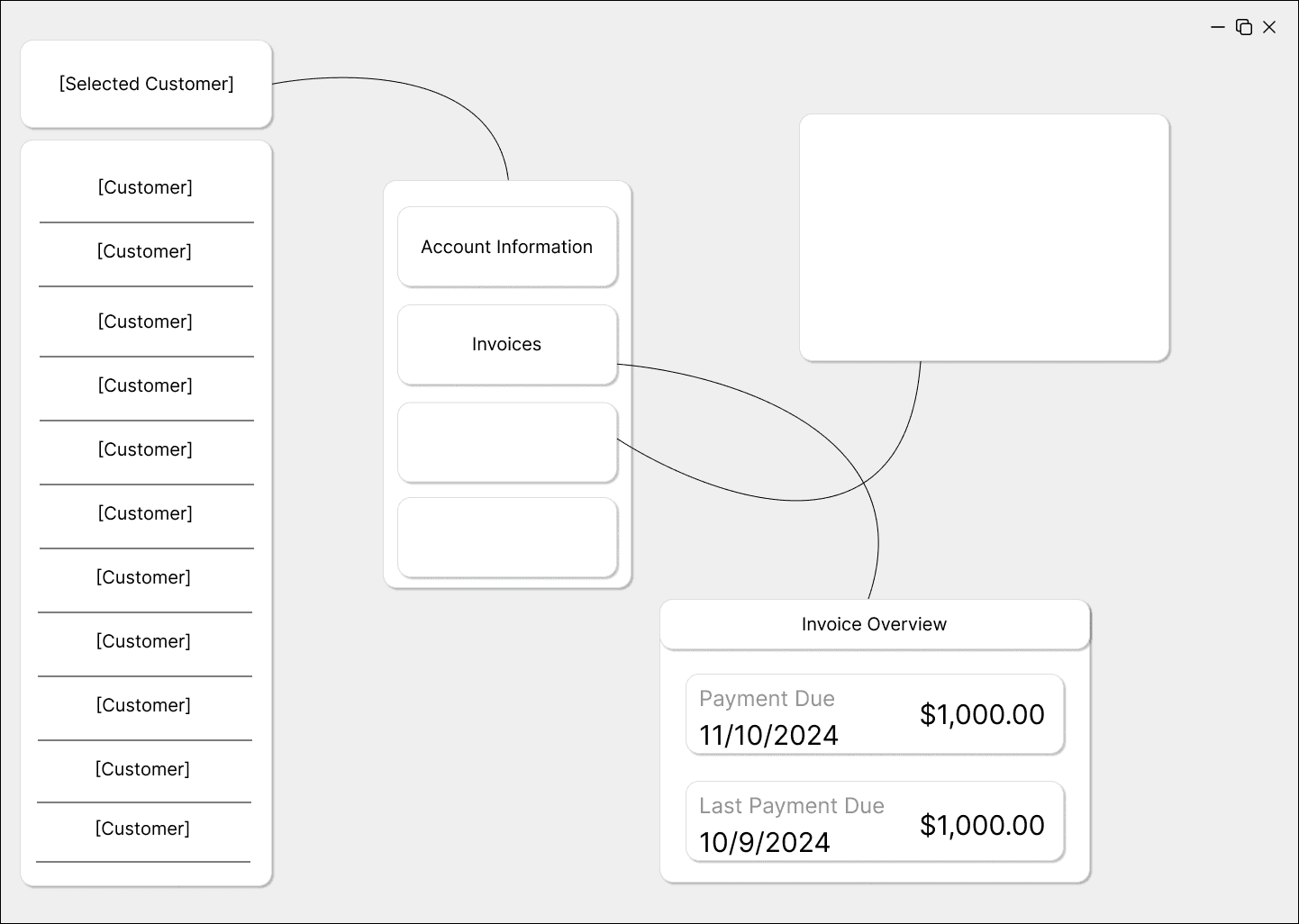
WIREFRAME 2
WIREFRAME 2
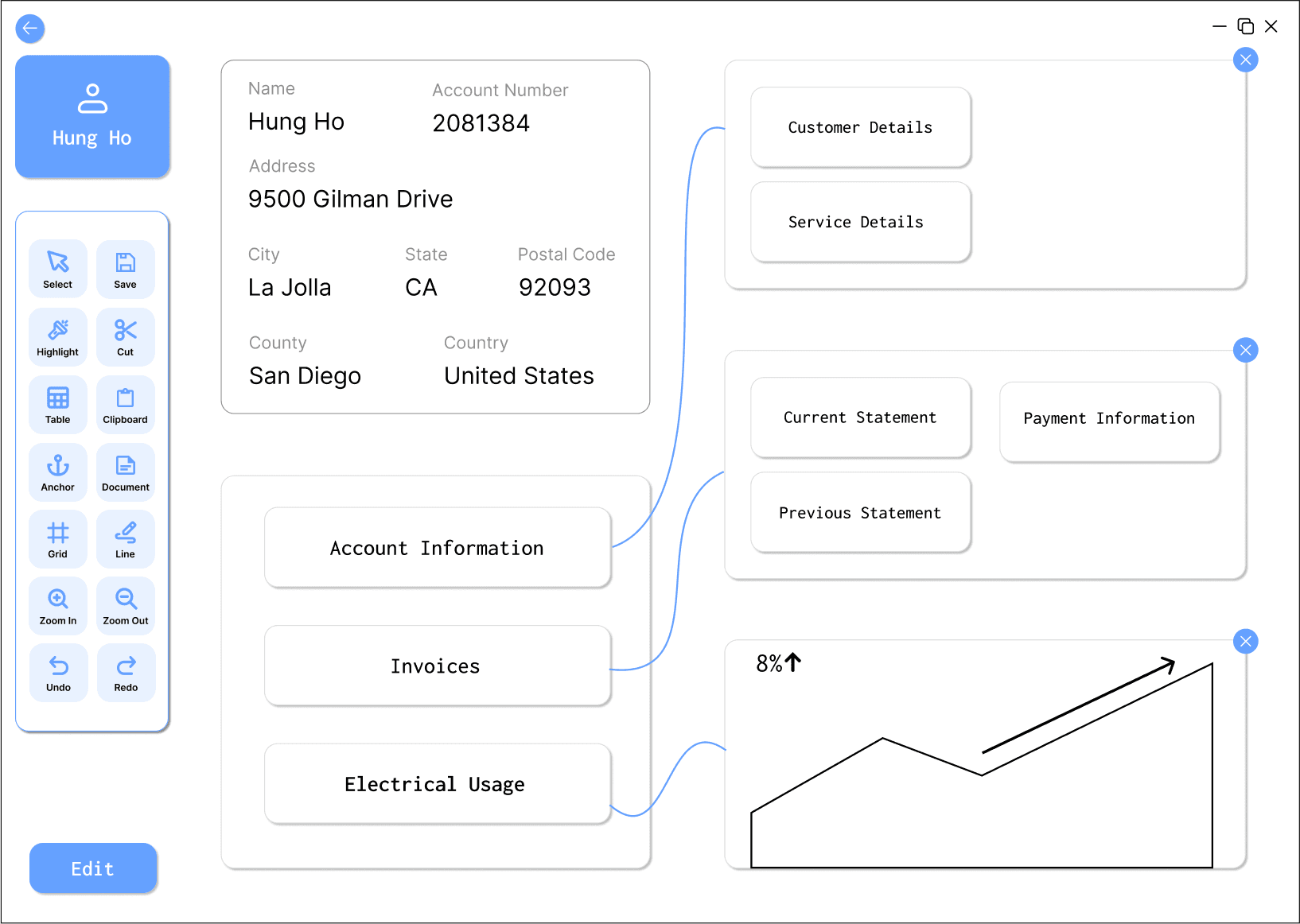
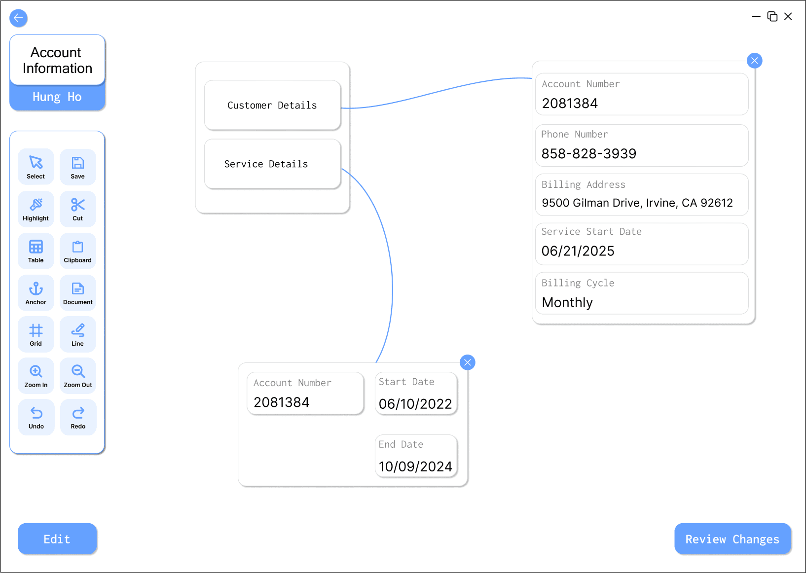
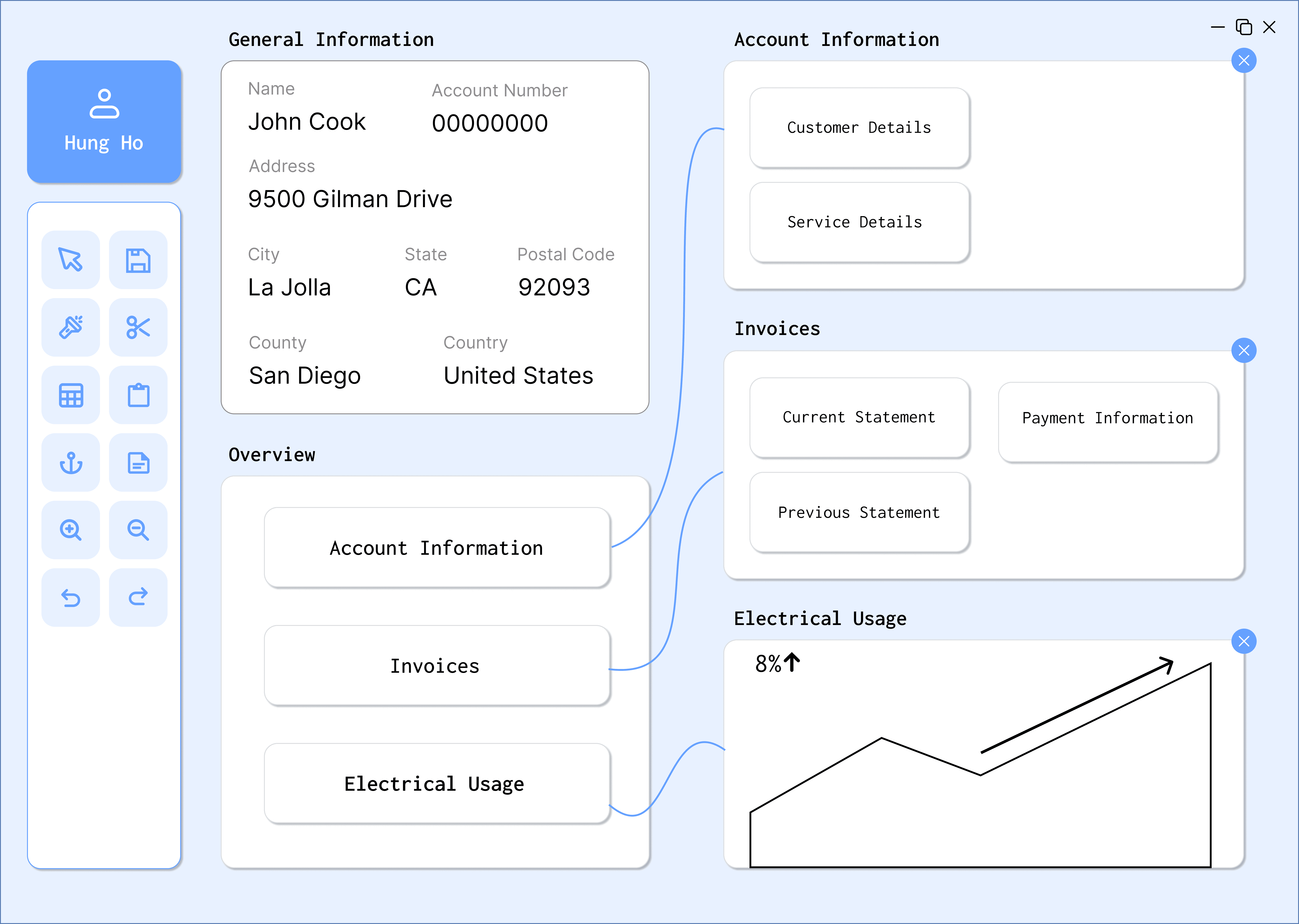
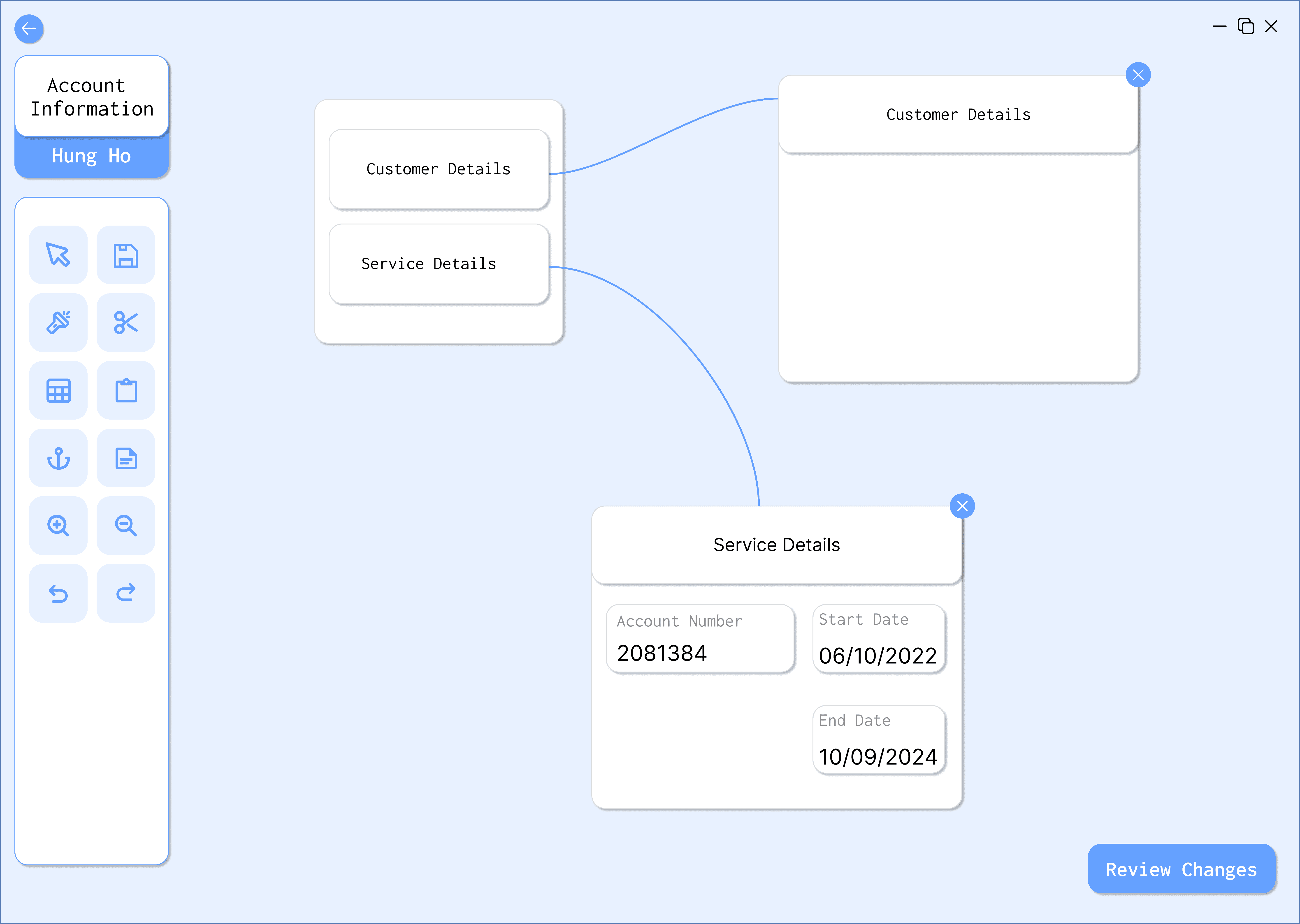
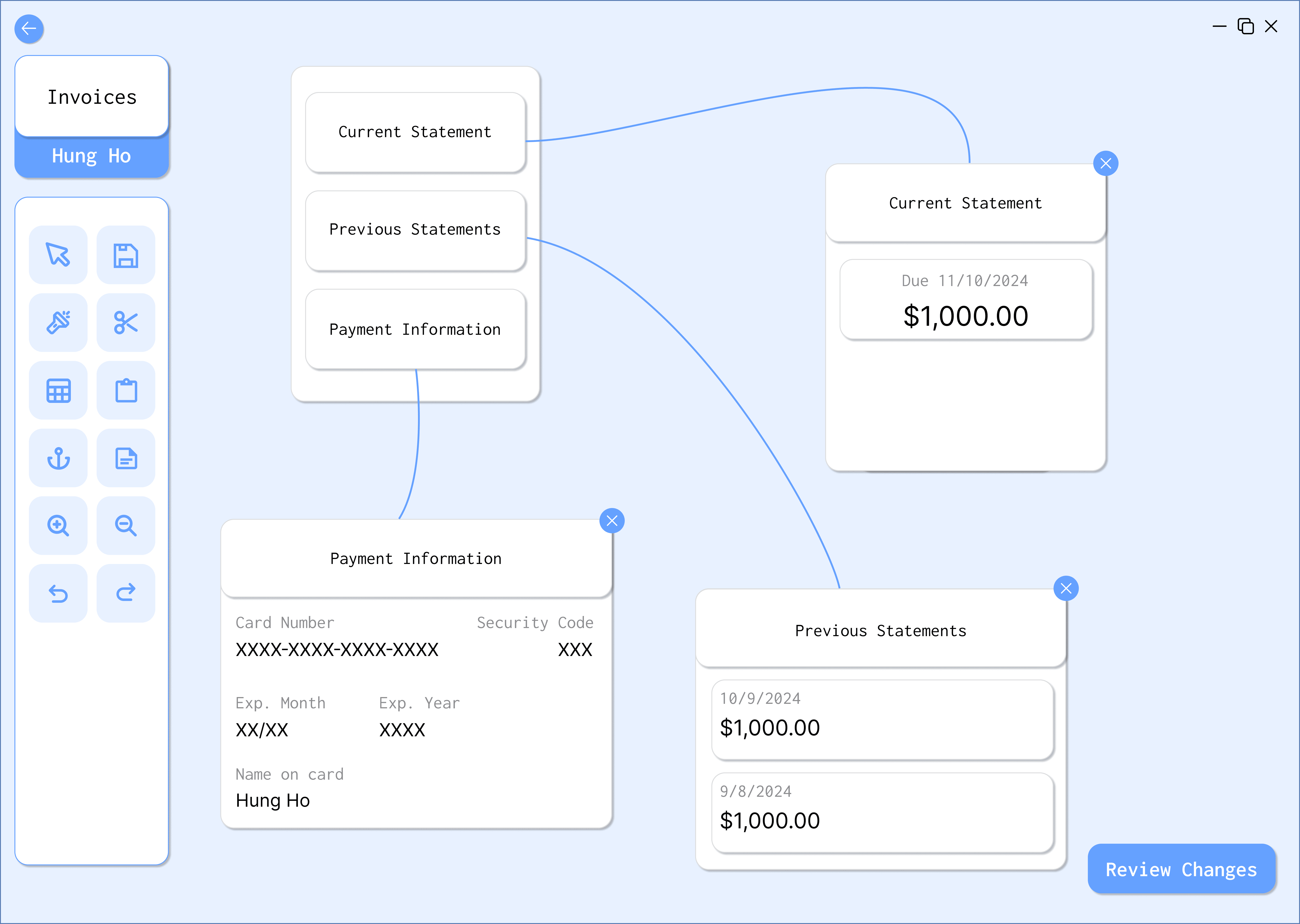
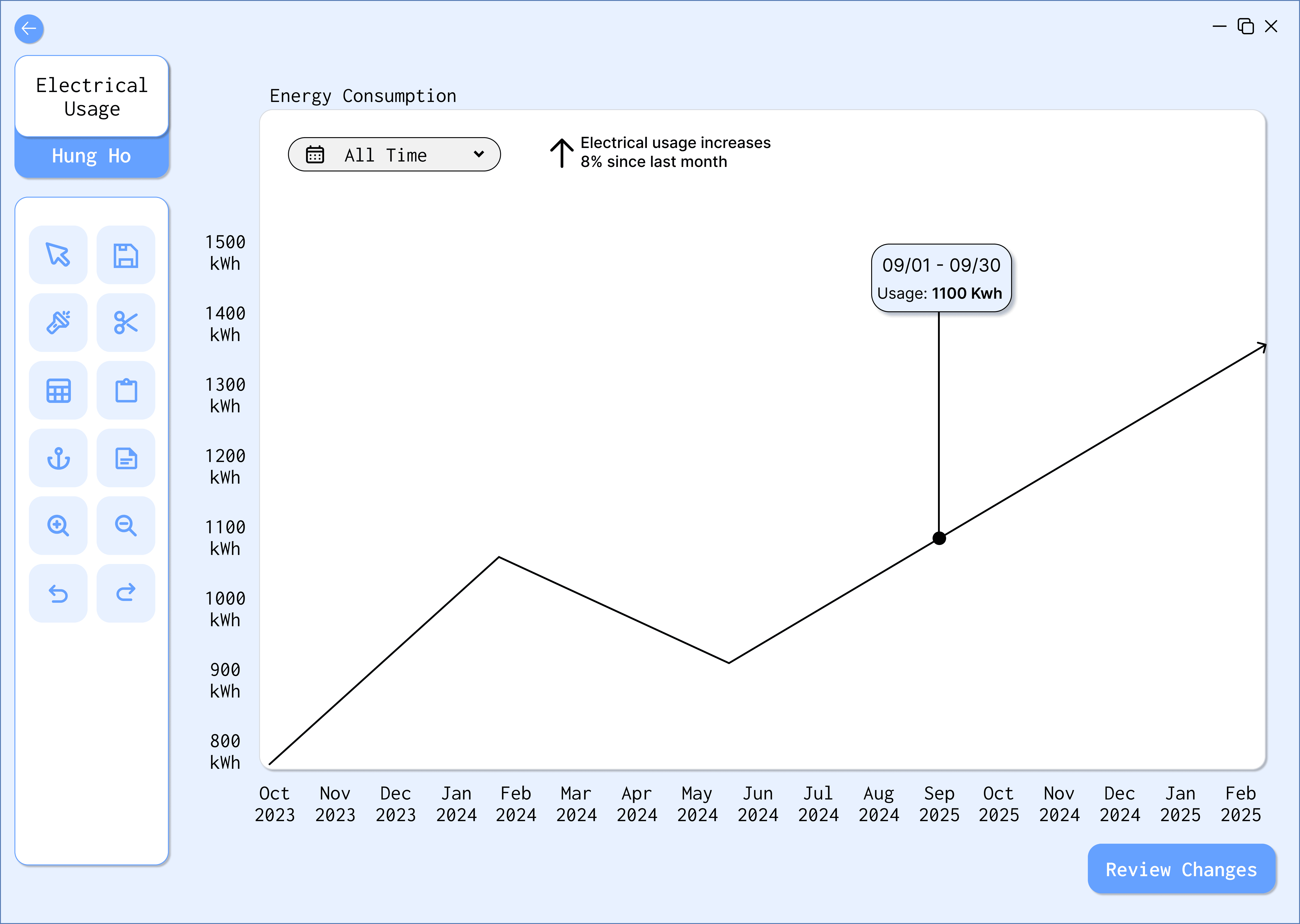
Our second wireframe takes a more experimental approach. Every element is organized as nodes on a canvas with a clear representation of inter-connections. This wireframe allows for flexibility in arranging the workspace information and tools, resulting in a more dynamic and personalized working experience.
Our second wireframe takes a more experimental approach. Every element is organized as nodes on a canvas with a clear representation of inter-connections. This wireframe allows for flexibility in arranging the workspace information and tools, resulting in a more dynamic and personalized working experience.

[3] User Testing
[3] User Testing
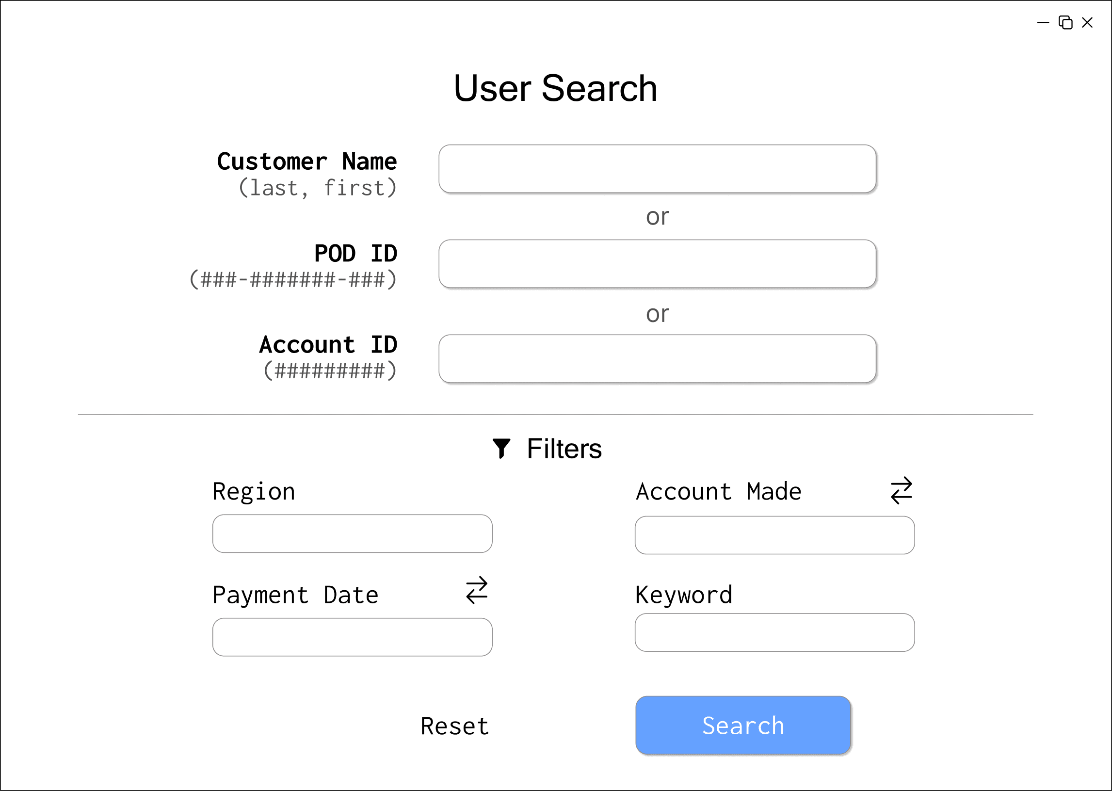
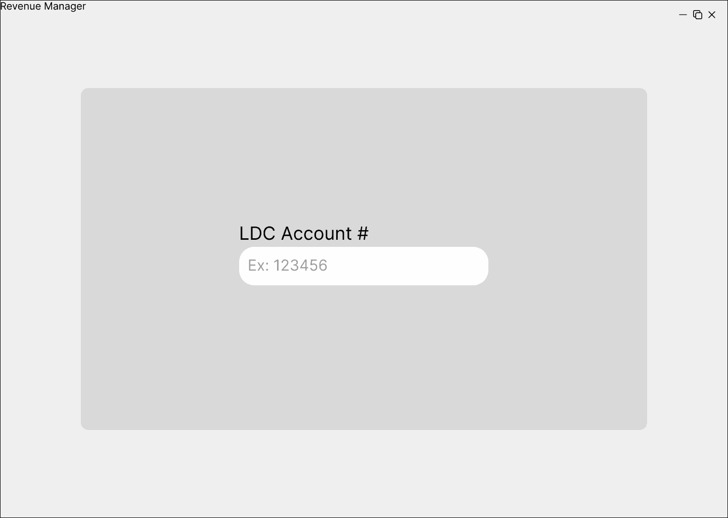
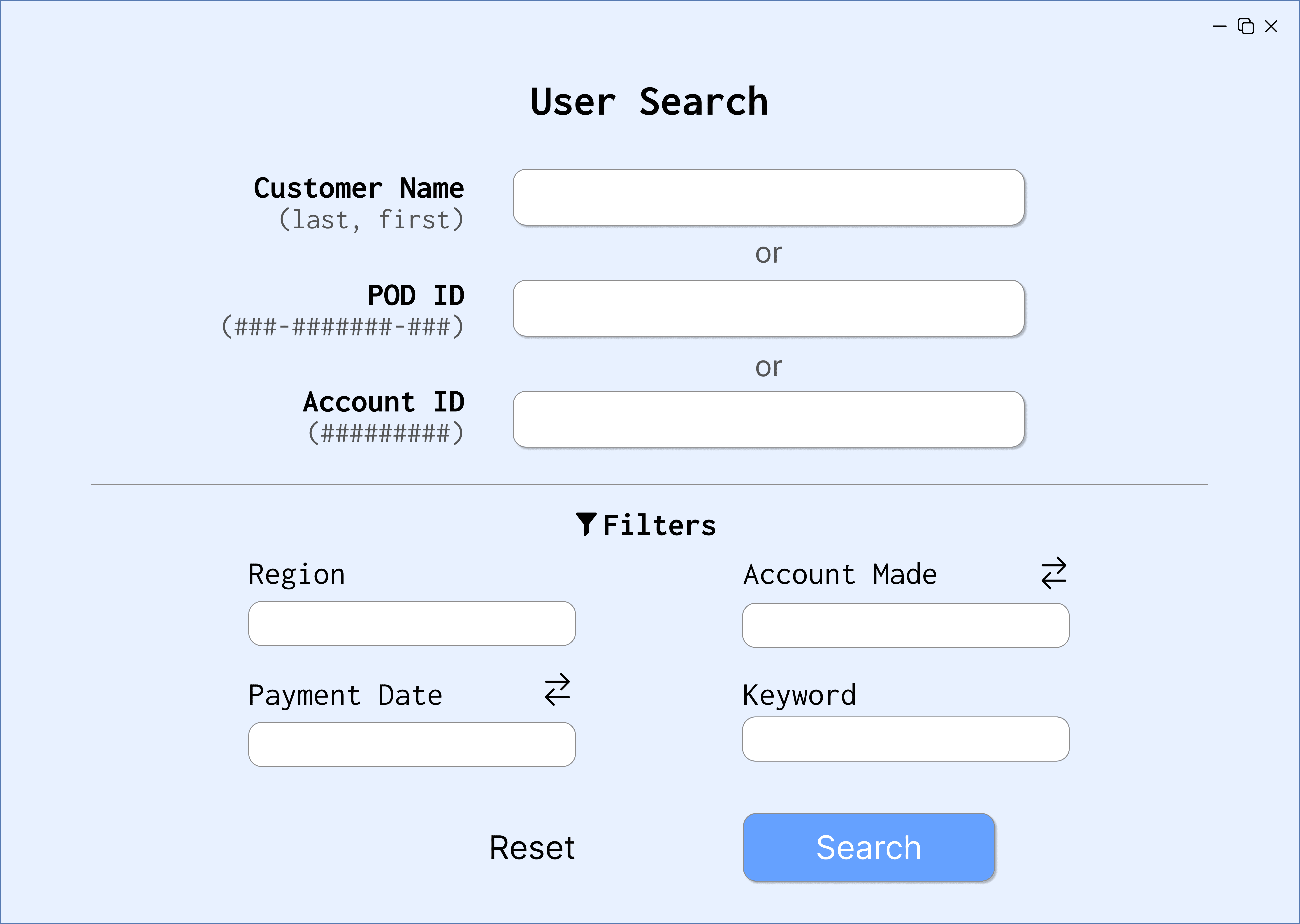
TASKS
Enter the LDC account number that the customer is under
Search for and select a customer
Find customer information (city, state, zip, etc.)
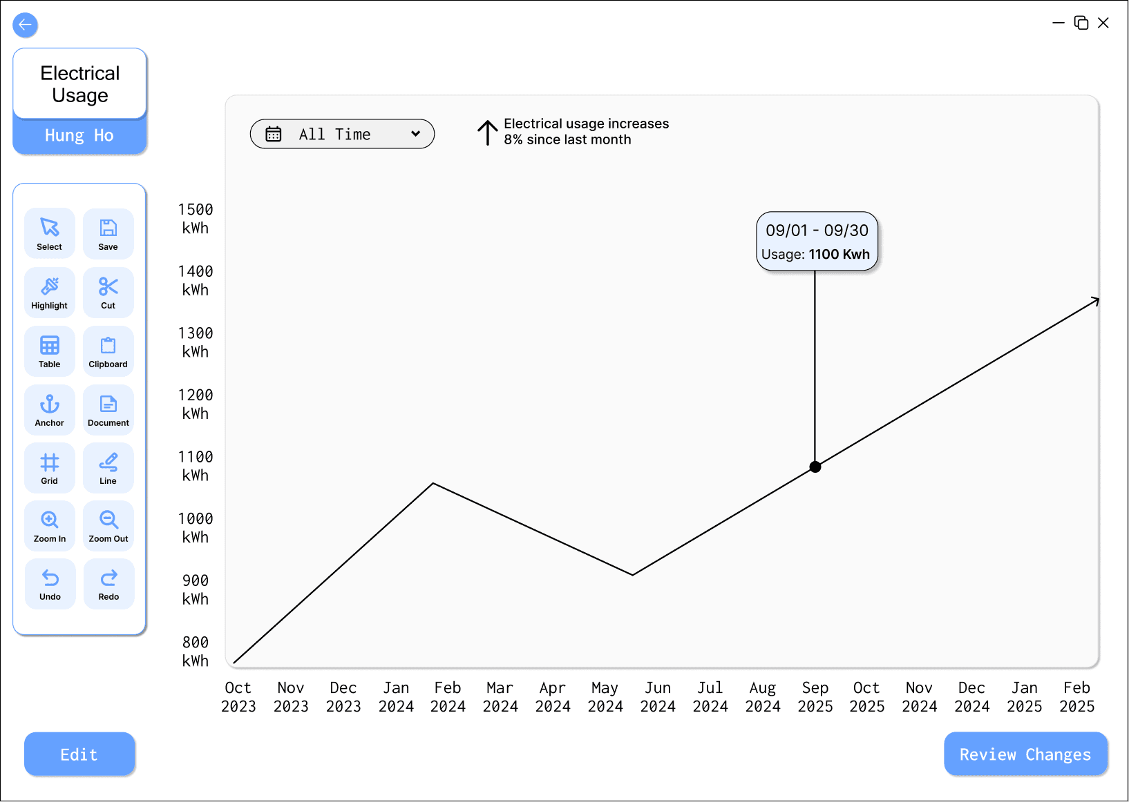
View the customer’s account information
View the customer’s invoices
TASKS
Enter the LDC account number that the customer is under
Search for and select a customer
Find customer information (city, state, zip, etc.)
View the customer’s account information
View the customer’s invoices
POST-INTERVIEW QUESTIONS
What do you think the purpose of this application is?
What do you consider to be easy or difficult about the tasks?
Are there any functionalities you think are missing?
Is there any content that is confusing or unnecessary?
Which prototype do you prefer?
Any other thoughts overall? (any concerns, comments, etc…)
User Test Findings
User Test Findings
The user testing results indicate a preference for a design that not only simplifies navigation and error detection, but also provides customer information in a customizable format. This mix of visual tools and detailed data access is essential for our design’s efficiency and effectiveness. Going forward, we focused more on the design of Wireframe 2.
The user testing results indicate a preference for a design that not only simplifies navigation and error detection, but also provides customer information in a customizable format. This mix of visual tools and detailed data access is essential for our design’s efficiency and effectiveness. Going forward, we focused more on the design of Wireframe 2.
USER #1: Data Analyst (Original Stakeholder)
Wireframe 1 Likes:
general information page
toolbar
Wireframe 2 Likes:
advanced search function
preferred Wireframe 2 overall
USER #1: Data Analyst (Original Stakeholder)
Wireframe 1 Likes:
general information page
toolbar
Wireframe 2 Likes:
advanced search function
preferred Wireframe 2 overall
USER #2: Purchasing Coordinator
Wireframe 1 Likes:
ability to organize with tabs
toolbar
Wireframe 2 Likes:
overall experience
node-based interface felt more efficient and easier to use
USER #2: Purchasing Coordinator
Wireframe 1 Likes:
ability to organize with tabs
toolbar
Wireframe 2 Likes:
overall experience
node-based interface felt more efficient and easier to use
[4] High Fidelity Prototype
[4] High Fidelity Prototype

PROTOTYPE FEEDBACK
PROTOTYPE FEEDBACK
We were able to get feedback on our high fidelity prototype from our original stakeholders. They were receptive to the overall visual design of the interface. They mentioned that the high-fidelity interface is simpler than their current interface and as such, they were able to understand the main purpose of each screen without needing an explanation.
One stakeholder didn’t understand the purpose of the nodes since each box connecting to the nodes also has a label on it. They liked the idea of nodes and wished we could change the box's design to allow the nodes to have a purpose.
The other stakeholder stated that the customizable workflow could make it easy to have a cluttered and messy workspace, asking if there is a “lock” button that holds modules in a relatively proportional position on the screen to enforce a cleaner space.
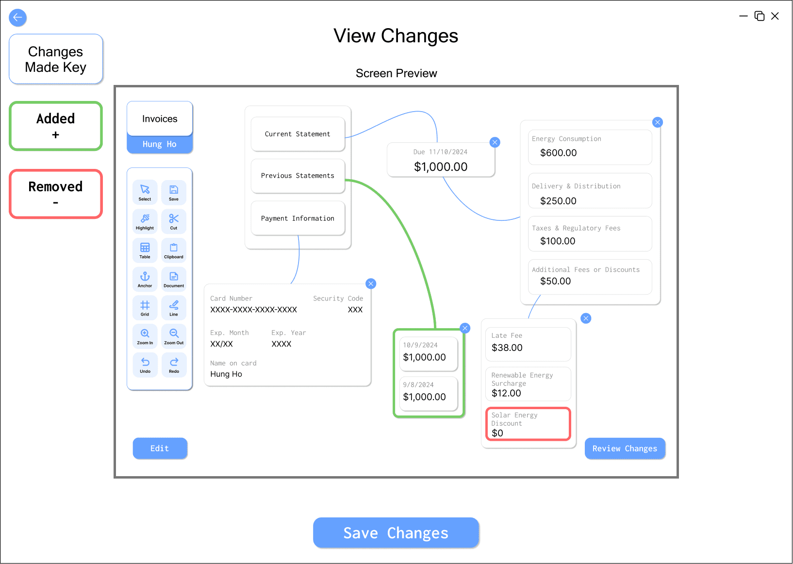
[5] Final Solution
[5] Final Solution
We implemented several key improvements to enhance our prototype’s clarity, consistency, and aesthetics:
We implemented several key improvements to enhance our prototype’s clarity, consistency, and aesthetics:
Made the workspace background white instead of light blue, to adopt a more standard look into the workspace.
Removed the heading from the sub-modules to remove redundancies because the lines clarify the context.
Added a grab tool feature, allowing the user to reposition the modules.
Added a grid tool to help with alignment, making it easier to organize elements precisely and maintain a clean, structured layout
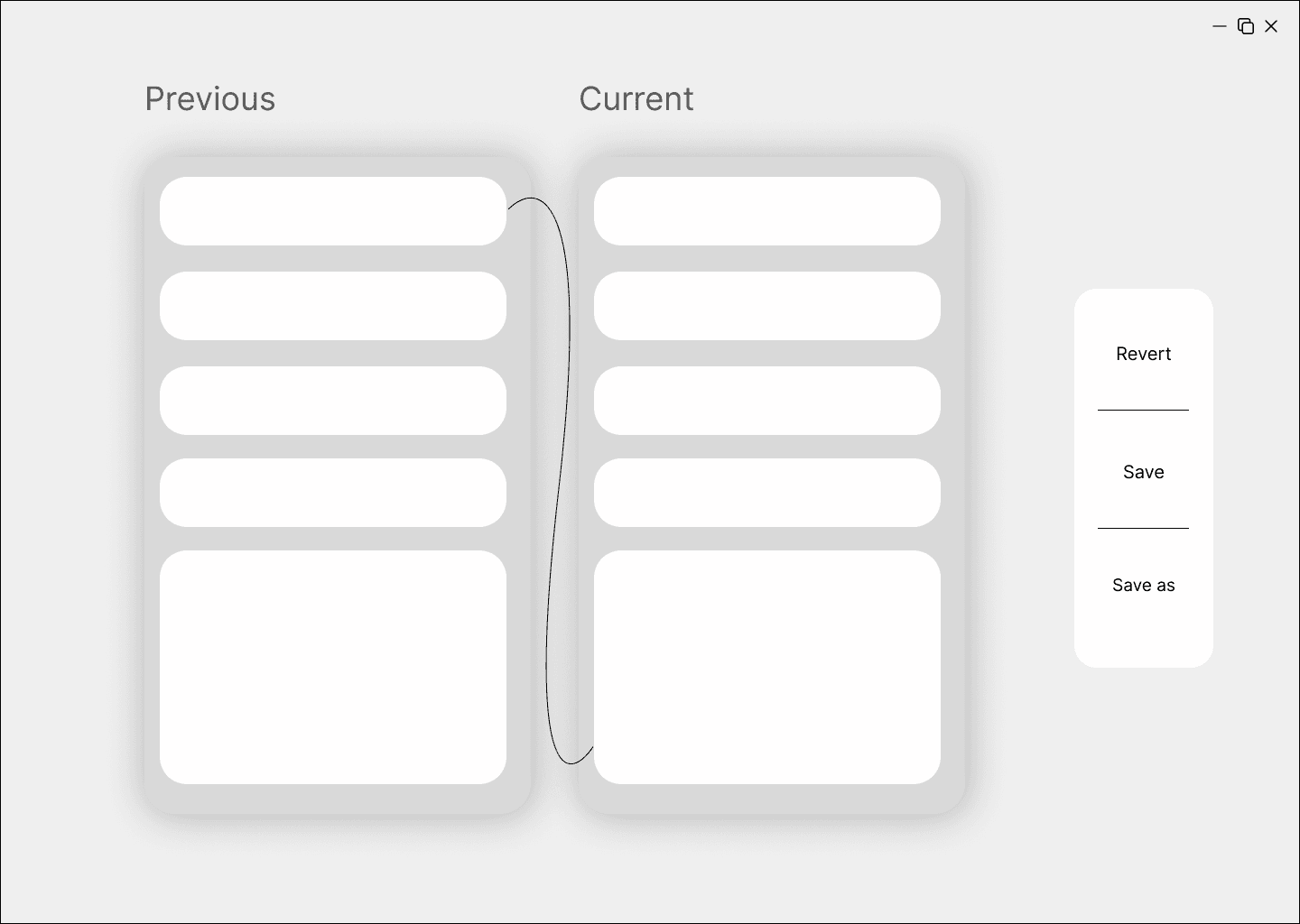
On the review page, we added the green and red highlights in the form of lines that present the added/removed information for a cleaner, clearer look.
Made the workspace background white instead of light blue, to adopt a more standard look into the workspace.
Removed the heading from the sub-modules to remove redundancies because the lines clarify the context.
Added a grab tool feature, allowing the user to reposition the modules.
Added a grid tool to help with alignment, making it easier to organize elements precisely and maintain a clean, structured layout
On the review page, we added the green and red highlights in the form of lines that present the added/removed information for a cleaner, clearer look.